
SÓS
A young man lives alone in an old mansion. In the darkness that permeates the house, he is tormented by its emptiness. The line between the real and the supernatural blurs as paranoia progresses.
SÓS is an independent horror short-film which addresses issues such as loneliness, insomnia, delusion, and the sense of dissociation. I took part in this production as a Graphic Designer, which meant I was responsible for creating the visual identity: the logomark, the credits and the poster.
Directed by Maria Jorge, Nuno Dias & Guilherme Vieira.
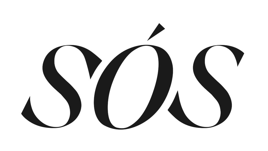
I chose to use the Silk Serif font family, designed by SilkType, because of its’ thin, pointy, heavily bracketed serifs, translating a sophisticated, yet threatening, look which resembles the uncanny tone of the short-film. In order to make the logomark stand out, I used the italic font style, as well as tweaked the “s” serifs to create a sort of extension between the two of them, connecting two of their extreme points to the middle.
The color palette is a direct translation of the color grading used for the photography, consisting of two predominant colors: a warmer golden color and a colder shade of blue, giving the sense of contrast between two opposite settings.
For the opening credits, I used the logomark and meshed it with the background, but using it’s opposite primary color grading, bringing out the blue, colder shades.
For the final credits, I used the same font family as the rest of the visual identity, and created a clean and simple design, which varies from frame to frame.
Graphic design.
Braga, 2024